 |
| New Zealand’s rugby players celebrate with the traditional Haka after winning the rugby gold medal. (AFP) |
After having posted several times on the Reinhart-Rogoff 2010 (RR, NBER and AER versions) vs. Herndon-Ash-Pollin 2013 (HAP) controversy (posts 1, 2, 3, 4), in particular with respect to the prominent role that New Zealand 1946-1951 played in their results, I want to come back (hopefully) one final time to wrap up the outstanding issues. I have benefited from extensive email correspondence with several people much more knowledgeable about New Zealand’s economic history and its statistical representation than I was when I got involved in this question, in particular Jean-Bernard Chatelain (Université Paris I), Jeff Cope (Statistics NZ), Brian Easton (economist and statistician, NZ), Viv Hall (Victoria University of Wellington), John McDermott (Reserve Bank of NZ), Keith Rankin (economist and economic historian, NZ), Mark Sadowski (University of Delaware), and Bart van Ark (Executive Vice President & Chief Economist, The Conference Board).
I come to praise Reinhart-Rogoff (RR), not to bury them.
This backhand compliment out of the way, let me start by actually praising them.
1. RR must be thanked for compiling vast databases on financial crises, debt and economic growth. By compiling such comprehensive, worldwide data over such a long period, RR have convincing demonstrated that the present ‘Great Recession’ is not a black swan event at all. And that possibly we can learn something from previous events of a similar character (although, as we shall see, we have to be extremely cautious about how we go about this).
2. Using these databases they have formulated important conjectures that have, for better or worse, played a major role in the political discussion. In particular,
a. They have conjectured that recovery from major financial or banking crises is significantly slower than recovery from ‘normal’ recessions;
b. They have argued that high levels of public debt are very inimical to economic growth, and, either as an artefact or a deliberate intention of their studies, the 90% public debt/GDP ratio is some sort of threshold or cliff after which things deteriorate very rapidly. (RR have in fact played a peculiar double game on this issue, sometimes emphasizing the 90% threshold, at other times saying there is nothing “magical” about it. See for instance their 2010 FT , 2011 Bloomberg and 2013 New York Times articles and 2011 Congressional testimony.)
Now that I have actually praised them, I’ll cut to the quick to some critical issues that I think everyone can now agree on, but will not dwell on any further here:
1. Regardless of the methodology or data used, there is a rather weak inverse correlation between growth rates and public debt ratios (it’s actually much stronger at very low debt ratios – under 30% -- than at very high ones, and nothing is said about the direction of causality);
2. There is absolutely no evidence for a debt cliff or threshold at 90% or any other value (a point I made in my post on dragons, and is summarized here in econometric detail).
3. Despite this inverse correlation, there is still remarkably high dispersion in the data, so that countries have existed e.g. with debt ratios of 150% and +6% growth, and 180% and -5% growth.
Now to New Zealand
The public debt/nominal GDP ratio
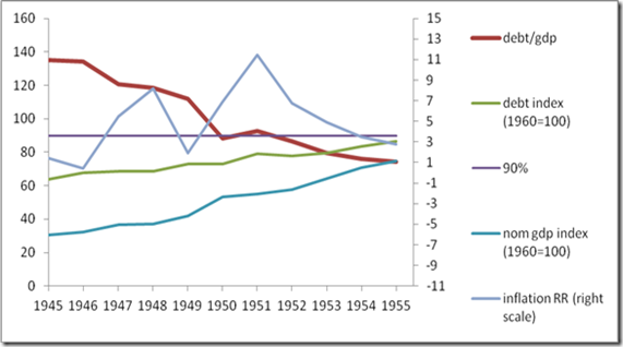
One can rightly ask why such a small and peripheral country should play such a disproportionate role in a study on debt and growth in the entire Western world in the post-war period. In the interwar period this is perhaps more obvious, since NZ attained a total public debt ratio of all of 249% in 1933. But for the RR 2010 paper we are only concerned with the period 1946-2009, when NZ only had a debt ratio over 90% for a few years immediately after the war. These were 1946-49 and 1951, see Figure 1 (1950, when the ratio dips to 88%, is a case I will come back to). While seven countries experienced debt ratios over 90% in RR’s database, of varying length (up to 19 years for the UK and Greece), NZ is catapulted into prominence because of several peculiar aspects of RR’s methodology. First, they only use the 1951 observation and leave out 1946-9 (as they later explained, the debt ratios for these years were not yet available, although it should have been clear that they were over 90%). Second, RR take each country’s growth experience in a debt category as a single observation by averaging over all that country’s years, instead of retaining each country-year as an individual observation. Thus NZ counts as 1/7th of the high-debt observations, as much as the UK and Greece, even though it only has one year in the category. Finally, the growth rate of real GDP for the one year they do use, 1951, based on the Maddison 2010 database, is exceptionally low (minus 7.6%). Given that the other NZ years of high debt had some very high growth rates, these factors in concert severely depress the mean and (somewhat less) the median of the sample growth rates for debt ratios over 90%. Simply inputting the other four NZ high-debt years and weighting all country-year observations equally, as HAP show, boosts the mean growth rate of high-debt countries by over 2%.
Figure 1 New Zealand public debt dynamics 1945-1955. Indices are for nominal values of debt and GDP. Computed from RR’s original spreadsheets from HAP/UMass website. 90% is RR’s dividing line for high debt ratios. Inflation rate in per cent, right scale. Notice the jig the debt ratio makes around 90% in 1950-51 during wool boom take-off.
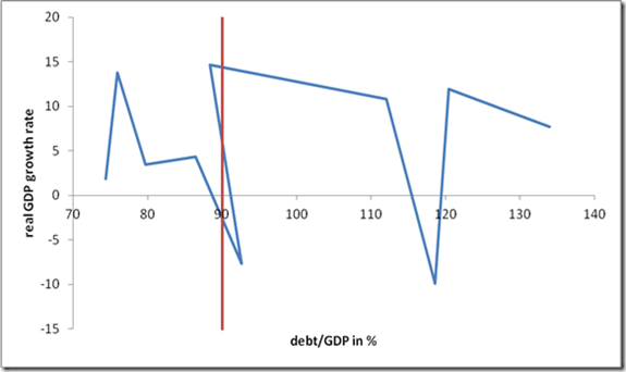
Figure 2 Debt ratio vs. real GDP growth rate (based on Maddison 2010 data as employed by RR 2010) for NZ 1946-1955. The 90% line self-selects high growth in 1950 into the lower debt category but returns the low growth rate of 1951 into the high debt category, although the absolute debt level was unchanged.
There is one more curious artefact of RR’s treatment of the NZ 1946-51 data that needs to be addressed that as far as I know has not been mentioned by HAP or anyone else. The year 1950 falls out of the 90+ debt category only to return to it in 1951, not because the debt had been reduced in absolute level (it was exactly unchanged! – see Figure 1) but rather because of the high growth rate in that year. Remember that RR are correlating debt ratios, i.e., nominal debt/nominal GDP, with real GDP growth rates, and this ratio will fall if either debt falls or nominal GDP rises. In the period 1946-51 NZ is by chance rapidly reaching the critical bin boundary of 90%, so that the growth rate becomes a self-selecting trigger determining if NZ is counted in the 90+ category or the more benign 60-90% one. High growth in 1950 shoves it to the left, low growth in 1951 shoves it back to the right, even though the debt level is unchanged, so we now have causality running clearly from growth to the debt ratio in such a way that a year with high growth does not get counted as high debt, but the following year with low growth does. This is a very funny and certainly unintentional artefact of the RR methodology of imposing a rigid bin boundary at 90% and correlating two variables that both depend (inversely) on GDP, as well as the adventitious fact that NZ just happens to be at the 90% value in this period. Near the bin boundaries RR’s methodology automatically sorts the data into high debt/low growth and lower debt/high growth subcategories if the absolute debt level is constant. If we restore 1950 to the high-debt sample (the ratio dips briefly to just below 88%), the average growth rate for years in which NZ has a debt ratio above “90%” rises from -7.64% (just the year 1951, as in RR 2010) to 2.57% (1946-49+1951, as in HAP) to 4.59% (all six years 1946-1951). Thus if we really want to weight the NZ data from this period as strongly as RR’s methodology compels, we can make an even stronger case for high mean growth rates in the 90+ category than even HAP were prepared to make. Including 1950 in the sample boosts NZ mean growth by another 2.02% and boosts the result for the entire country sample (using RR’s original country weighting method) by another 2.02%/7=0.29%.
Thus exactly at the bin boundaries the much-discussed issue of the direction of causality—from debt ratio to growth or vice versa—can become highly amplified in RR’s counting procedure, as the NZ jig at 1950 illustrates. It remains to examine to what extend this might also apply to other countries and years.
Wool boom and industrial unrest
Before examining the data issues, let us begin with the undisputed facts about this period in NZ economic history. First, the economy took off at the end of the 1940s, and particularly with the outbreak of the Korean War in June 1950, because of the wool boom (Figure 3). Economists call this a terms-of-trade shock, when the price of a major export commodity suddenly rises, generating windfall profits and desperate attempts to increase production (to the extent that children would apparently be sent out to gather wool caught on the barbed wire fences). As a pastoral product, however, wool supply is highly inelastic in the short run, so nominal and real income effects can diverge, resulting in inflation.
Figure 3 This Gordon Minhinnick cartoon, published in The New Zealand Herald in November 1950, alludes to the wool boom that resulted from the Korean War. The man with the glasses is then NZ PM Sid Holland, followed by NZ average citizen. (Source: Te Ara/Encyclopedia of New Zealand).
According to the Te Ara/Encyclopedia of New Zealand,
… the Korean War had an enormous economic impact on New Zealand. It precipitated a boom in wool prices that led to a stupendous influx of money into the country, leaving farmers more prosperous but unsettling the rest of society as inflation affected the cost of living. When an industrial dispute on the waterfront threatened this bonanza in 1951, the government declared a state of emergency and used the armed services to load cargo.
Wool prices tripled in 1950 in response to American stockpiling (see Figure 4), but a price ceiling imposed by US authorities early in 1951 caused prices to fall back again by 50%. At the same time, partly as a result of the inflationary situation induced by the wool boom, the waterfront workers were locked out by the government (they had been offered only a 9% wage increase while other unions had agreed to 15%). Sympathy strikes spread to coal mining, meat freezing, railroads and hydroelectric industries (see my post “One strike and you’re out”, which sparked my interest in this subject).
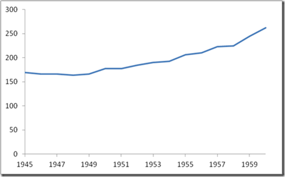
Figure 4 NZ wool price index. The wool boom already starts at the end of the 1940s and peaks briefly in 1951. (Source: SNZ)
Figure 5 NZ wool production, 1000 tonnes. (Source: SNZ)
However, the volume data in Figure 5 indicate that the wool boom was more a price than a quantity phenomenon. The rise is very gradual, and there is no volume decline after the price peaks in 1951. So at least for this important component of exports, real output shows no volatility at all. The volatility is entirely in the price. What we cannot exclude, however, is that the income effects induced by the price volatility had no real repercussions on production in other sectors (as well as on imports).
Real GDP chronologies
Now, for the purposes of RR’s study of debt and growth, we need time series for nominal GDP (to compute the debt/GDP ratio) and real GDP (to measure performance). The difference between the two growth rates will be the inflation rate. RR obtain their real GDP data for NZ from the well-known Maddison 2010 database, but turn to other sources for their RRR 2012 paper. A second series is available from Statistics New Zealand in their Long Term Data Series (LTDS) (note that SNZ did not begin compiling official time series according to the UN’s System of National Accounts until 1955). And recently a quarterly series has become available from Hall and McDermott 2011 (HM).
In previous posts I talked about a “post modern nightmare” of data incompatibilities and inconsistencies. It gets worse, but it also gets better. I’ll list some items of confusion and how they can be resolved.
1. Both the Maddison (after 1939, see his Monitoring the World Economy, OECD, 1995, p. 134) and the SNZ real GDP series are for NZ fiscal years, not calendar years. A NZ fiscal year in the relevant period is April 1- March 31.
2. However, Maddison dates his year from the starting day, and SNZ from the ending day of the fiscal year. This explains why these data series are shifted by one year. Thus for Maddison, fiscal year April 1, 1951 to March 31, 1952 counts as 1951, while for SNZ it is 1952. Hence any methodology that critically depends on annual chronology can easily become misspecified by not recognizing that these are fiscal years, 9 months of which fall into the first calendar year, and 3 months of which fall into the next one, and different statisticians can choose which calendar year they assign them to. This explains why 1951 is a recession year for Maddison but only 1952 is for SNZ, even though they are talking about the same fiscal year and same recession. In terms of synchronicity with the calendar, Maddison is still the preferred series, and the SNZ series should be moved up one year when it is a question of high-frequency timing. Since RR are correlating contemporaneous annual debt ratios and growth rates, this is not unimportant in getting things right.
3. The SNZ “Maddison Index” of real GDP on its LTDS has a typo error for 1946 (they give 219.9 instead of the original value of 217.9 from Maddison’s Monitoring the World Economy, OECD, 1995, and carried over into the online 2010 database). Since I was using the SNZ LTDS-Maddison Index instead of going back to the Maddison source, this led me to suggest that RR had also made a transcription error resulting in slight discrepancies (+-1%) in the NZ growth rates for 1946 and 1947. I apologize for this aspersion to RR’s already much maligned integrity – the error was SNZ’s, and they have already corrected it in the LTDS table (personal communication Jeff Cope).
So what do the GDP time series show about NZ in the early post-war period? Figure 6 graphs the growth rates in real GDP from the different sources.
Figure 6 NZ real GDP growth rates: quarterly data from Hall & McDermott (2011), annual data from Maddison (2010) and SNZ $90 constant price series shifted forward one year.
Growth rates are computed from the quarterly HM data in three ways. First, I compute the annual growth rate from a quarter and the previous year’s same quarter. Second, I compute the growth rate from one quarter to the next one, annualized. Finally, I take a running sum of four quarters and compute the growth rate to that sum one year previous. The Maddison annual growth rates are applied to the four quarters in that fiscal year (thus Maddison 1950 applies to 1950q2-1951q1), and are compared to SNZ $90 year 1951 (encompassing the same four quarters 1950q2-1951q1).
If we take the HM growth rates as both the highest frequency and most chronologically exact representations, then we see that the three sources are fairly consistent internally and make sense in terms of what we know about NZ economic history. The wool boom, perhaps somewhat surprisingly, already takes off in the second half of 1949, even before the outbreak of the Korean War, and peaks in early 1950. The economy then goes into recession in the first quarter of 1951, when we know that both the waterfront lockout/strike and the wool price ceiling occur.
Thus, to the extent that RR’s study requires a precise annual correspondence between debt ratios and real growth rates, the Maddison data as is or the SNZ $90 shifted forward one year are perfectly acceptable, though Maddison shows higher peaks in 1946 and 1947 and a lower trough in 1948. The 1951 recession is reconcilable between them once the respective datings of the fiscal year are understood, and they synchronize well with the three ways of extracting growth rates from the HM quarterly data. The conclusion stands in contrast with the approach RR take in RRR 2012 (Journal of Economic Perspectives), their May 5, 2013 data errata, and in their response to critics, “A Note on Data for New Zealand” April 27, 2013 post:
Poring over the time series we used in late 2009 for RR (2010) "Growth in A Time of Debt", it became apparent that the New Zealand GDP data used has an error. It is off by a year. The source of the problem on New Zealand is the original Maddison data. This has propagated over time.
The Total Economy Database at the Conference Board now updates the Maddison data and still has the error, at least as late as April 27, 2013. I have notified the Conference Board of the error.
Note that this does not affect the Journal of Economics Perspectives paper on "Debt Overhangs", where the data for the 1861-1979 comes from the New Zealand Statistics Office…
RR seem to have fallen victim to a misreading of how Maddison and SNZ date their annual series, and that they both refer to fiscal years April 1 – March 31 but with different years attached to them, which explains the one year shift. And from our comparison with the quarterly HM data it is clear that the Maddison data they used in their 2010 paper are closer to chronological time, and it is in fact the SNZ data that needs to be shifted up one year. Thus it appears that the RRR JEP paper needs to be revised and not the Conference Board’s administration of the Maddison database. Bart van Ark will be publishing a note on these questions in the near future on the Maddison project website.
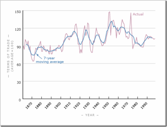
But can the extreme volatility of any of the real GDP growth rates for this period be believed? As we saw in Figure 4, the fluctuations in wool export prices, NZ’s primary export commodity, seem to be driving the economy in what is well known to economists as a terms-of-trade windfall (and subsequent crash). Looking at NZ’s overall terms of trade, we see the same pattern:
Figure 7 New Zealand’s overall terms of trade, annual data and 7-year moving average. (Source: SNZ and Encyclopedia of New Zealand)
The largest peak and crash occur in 1950/51, as we expect. To what extent are these extreme fluctuations merely driving nominal quantities as opposed to real output, and thus manifesting themselves primarily in inflation? A high proportion strikes me as extremely likely, especially in view of the few direct observations of volume indices such as wool production (Figure 5), or tallies of export tonnage (the NZ 1954 statistical yearbook records only a small decline of about 3% for 1951). This is a well-known problem in national accounts: when relative prices fluctuate significantly in a short time interval, it is difficult if not impossible to extract sensible changes in real quantities just using price deflators. (This also played a role during the energy crisis in the 1970s, where the apparent decline in productivity growth may partly be an artefact of such statistical anomalies.) Since we know that inflation took off in NZ in this period and contributed to the industrial unrest, I think it reasonable to assume that the fluctuations in real GDP growth were much more modest or even nonexistent than any of the available time series suggest. While a good case can be made that a contraction did take place in 1951, it seems unlikely that it was as large as -7.6% in real terms (nor that the preceding boom was +14%). And experts on NZ history still seem at a loss to decide how to apportion any real decline in 1951 between the disruptions due to the waterfront lockout/strike and the decline in the wool price and its knock-on effects.
In the end it is subtle shortcomings of RR’s methodology that thrusts the NZ experience accidentally to such a prominent position. These shortcomings are
1. Using just four bins for debt ratios instead of a much finer resolution, or disposing of binning entirely in favor of a fully formulated econometric specification or (semi)parametric estimator;
2. Correlating contemporaneous annual observations of debt ratios and growth rates instead of using moving averages of the time series. As we have seen, the bin boundary dynamics plays subtle tricks when a country’s debt ratio nears the boundary, self-selecting high-debt ratio/low growth pairs. NZ just happened to fulfil this criterion around 1950. And these historical time series (whether Maddison’s or any other source) are simply not accurate enough on an annual basis nor were they ever intended to support such fine tuning.
3. Not explicitly investigating causality by investigating a lag structure running one way or the other (although RR 2010 claim that lags had no effect on their original result without discussing the evidence).
4. While one can make legitimate arguments in favor of using average country growth rates in each debt ratio category instead of exploiting all country-years, for the dataset RR 2010 employ, this leads to the obvious deficiency that the small number of high-debt ratio observations for NZ (one, five, or six, as you choose) propel NZ into too crucial a role in determining the aggregate outcome. And NZ is obviously too small and peripheral a country to carry the burden of such a wide-ranging conclusion about the role of debt in long-term economic growth. Moreover, as we have seen, NZ’s growth experience 1946-51 is completely idiosyncratic and has nothing whatsoever to do with its debt ratio (which did not seem to be of any great concern to anyone at that time, and had been more than twice as high just 15 years earlier). Rather, it was driven by the vicissitudes of post-war demobilization, the wool boom/Korean War/terms-of-trade volatility and their resulting inflation, and a massive instance of labor unrest which came out of them. Abstracting from these historical vicissitudes in such a crude statistical study will always be inherently risky, even if no blatant data errors had been committed.
In one sense one could say that NZ’s role in this affair was fortunate, for it led to the exposure of a problem of greater significance in all quantitative science: how to guarantee the transparency and integrity of scientific research. Only the failure of many economists to reproduce RR’s original results eventually led to the necessary access to and scrutiny of RR’s data and methods. HAP have to be thanked for taking this thankless task onto themselves, but the chasm of quantitative abjectness this revealed (whether it affected the results significantly or not is entirely irrelevant) was simply breathtaking.
As someone who does economic modelling myself and has even dabbled in econometrics occasionally, I am all too familiar with the scope for making simple but discrediting errors, and thus have some sympathy with RR’s plight. However, that this paper could be so prominently published without peer review and making the data and spreadsheets available on the web (or at a minimum on request from other researchers) for three years, is really disturbing. It threatens to discredit all serious analytical thought in the popular mind, and not unjustifiably. The economics profession will have to devote more thought and rather quickly to devising reliable institutional procedures for guaranteeing transparency and integrity (see also Barry Eichengreen’s recent article on this issue, which perhaps downplays the question of intention, as I point out in my comment).
On the other hand, were it not for the incentives RR gave the profession to scrutinize the trials and tribulations of New Zealand during the immediate post-war period, we might still be the victims of oversimplistic and ahistorical threshold and causality delusions regarding the public debt-growth nexus (for the latest on that debate, see RR’s May 25 letter to Paul Krugman and the latter’s May 26 blog back).
